
The Ultimate Guide to Printing Professional Documents at Home
Professional output at home isn’t about expensive gear—it’s about sequence. Choose the right paper, lay out pages with sensible margins and readable type, export a clean PDF, and send that file through a stable driver path with correct media settings. Do those four things in order and your pages will look like they came from a quiet office printer—crisp, aligned, and predictable—without trial and error. This guide is brand-neutral and works for both inkjet and laser models. We’ll walk through paper science, layout do’s and don’ts, quality presets that actually matter, colour basics (kept simple), duplex and binding tricks, cost control, and a reliability routine so printing never feels like a gamble again.
You’ll see quick wins to try this minute, then deeper sections for people who want repeatable, “set and forget” results. The aim is simple: if you print homework, proposals, CVs, invoices, course packs or handouts, each page should feed smoothly, align nicely, and read clearly with realistic ink/toner use. Bookmark this guide; it’s a long-term reference you can dip into for years.
Quick wins (5 minutes to better pages)
- Load fresh A4 (80–100 gsm) from a sealed ream. Damp or curly sheets kill quality. Keep 10–15 sheets in the tray.
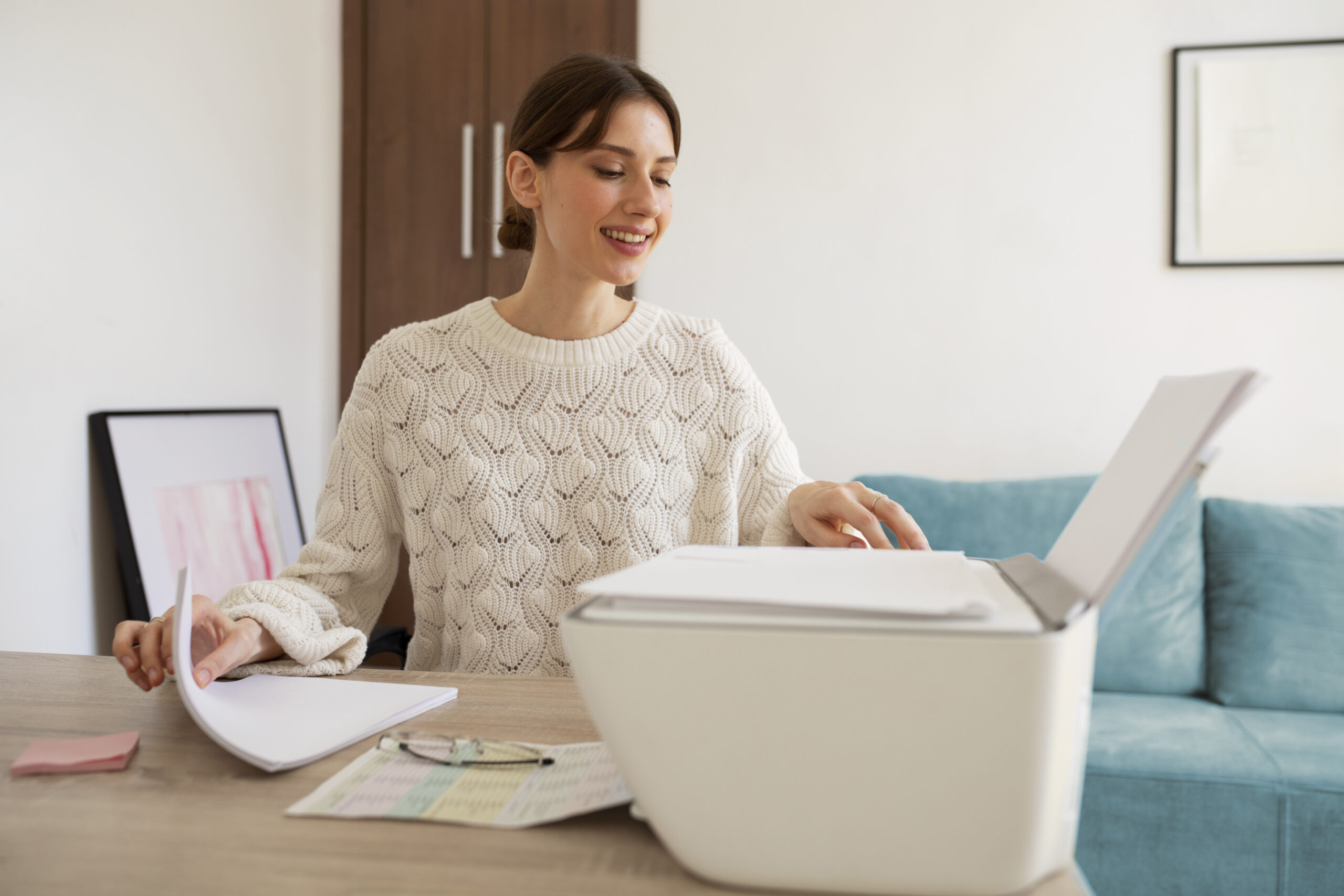
- Set paper size to A4 and media type to “Plain”. Start on Normal quality. Save Best for photos and dense graphics.
- Export your document to PDF before printing. PDF locks layout and fonts; what you preview is what you print.
- Use 12–12.5pt body text in a readable sans or serif; avoid over-tight line spacing. We’ll cover typography below.
- Test duplex with a two-page PDF and confirm the binding edge so page 2 isn’t upside-down.
Paper: the foundation of professional output
Weight, brightness, and finish (what to pick and why)
- 80–90 gsm “copy” paper (brightness 92–96): ideal for everyday documents, drafts, forms and invoices.
- 100–120 gsm premium: reports, proposals and CVs feel sturdier and duplex cleanly with less show-through.
- Matte vs satin vs glossy: use matte for text-heavy documents; satin/glossy is for photos or covers and needs matching presets.
Rule: tell the driver what you loaded. Thicker stock needs “Thick/Heavy” (laser) or a matching media preset (inkjet) so the printer slows the path and lays down colour correctly.
Storage & handling (quality without buying anything)
- Keep reams sealed; humidity makes edges curl and text look fuzzy.
- Load small stacks (10–15 sheets), fan gently, square edges, set guides snug—not tight.
- For duplex jobs, avoid the last bent sheets from an old ream; start a fresh mini-stack.
Layout that reads like a print shop’s work
Margins & line length
- Margins: 18–22 mm on all sides keeps content airy and safe for duplex.
- Line length: aim for 60–80 characters per line. Wider lines reduce comprehension and look “wall-of-text”.
- Headers/footers: keep small (9–10pt); avoid noisy rules and logos on every page.
Typography: professional with system fonts
| Use case | Safe font | Body size | Line spacing |
|---|---|---|---|
| Reports & proposals | Georgia, Cambria, Times New Roman | 12–12.5pt | 1.35–1.5 |
| Handouts & guides | Calibri, Segoe UI, Arial | 12–12.5pt | 1.4–1.6 |
| Resumes/CVs | Cambria, Calibri, Garamond | 11.5–12pt | 1.35–1.45 |
Small caps, wide letterspacing, and heavy colours look “designed” on screen but noisy in print. Keep it calm: normal weight for paragraphs, bold for headings, italics sparingly.
Images, charts and sharpness
- DPI: aim for 220–300 dpi at final size. Upscaling low-res images won’t add detail; better to reduce their size in layout.
- Colour fills: very dark full-page boxes drink ink/toner and show banding. Prefer 5–15% tints for callouts.
- Charts: use one bold accent colour and greys for the rest. Excess colours look muddy on plain paper.
PDF export: lock your layout before printing
Why PDF first?
PDF preserves fonts, page size, margins and line breaks. It prevents last-minute reflow when a dialog swaps defaults or a different app opens your file.
Good defaults for clean PDFs
- Page size A4, margins as above.
- Embed fonts; avoid “subset only” if you often make edits later.
- Images at 220–300 dpi; compress gently, not “smallest file”.
Open the PDF and scan each page at 100% zoom. If it looks right on screen, it will print right on paper.
Driver options that actually matter (Windows & macOS)
- Media type: Plain vs Photo/Coated vs Thick/Heavy—pick what’s in the tray.
- Quality: Normal for text; Best for dense graphics; Draft for internal proofing.
- Duplex: choose the correct binding edge (Long-edge for portrait A4). Test on two pages first.
- Colour mode: Greyscale for drafts; Colour for final. On inkjets, this alone halves cost for proofs.
Cost control without ugly pages
- Proof in Greyscale/Draft, final in Normal.
- Use 80–90 gsm for everyday, 100–120 gsm only for finals.
- Prefer vector charts and light tints over photo-heavy backgrounds.
- Print two-up handouts (two slides per A4) for study notes.
Reliability: make it just work every time
- Reserve the printer’s IP in your router (DHCP reservation). Then add the printer on computers via IPP/TCP so it never “goes missing”.
- Keep the printer on 2.4 GHz for reach; your laptop/phone can use 5 GHz freely.
- Monthly: wipe the first visible roller with a barely damp cloth; keep dust out of the tray area.
- Load fresh paper for important jobs; store reams sealed.
Step-by-step: from document to printed stack (baseline workflow)
- Review layout: margins 18–22 mm; body 12–12.5pt; line spacing ~1.4.
- Replace low-res images; ensure charts are legible at 100%.
- Export to PDF (A4, fonts embedded, images 220–300 dpi).
- Driver: A4, media=Plain, quality=Normal, duplex=Long-edge (if needed).
- Print 2-page test; confirm orientation and margins; then print the whole set.
Advanced: duplex & binding that looks “office-grade”
Perfect duplex alignment
- Run a 2-page test with a border box to check front/back registration.
- If the back is slightly offset, look for “reduce bleed” or “border shift” options in the driver and adjust by 0.5–1 mm.
- Use heavier 100–120 gsm stock for duplex to reduce show-through.
Binding choices (home-friendly)
| Binding | When to use | Tip |
|---|---|---|
| Staple (corner) | Short reports, handouts | Leave a bigger top/left margin (22–25 mm) |
| Plastic comb | Course packs, manuals | Use 100–120 gsm; add a simple title page |
| Wire/spiral | Workbooks | Check that inner margins clear the holes |
Colour kept simple (brand-neutral basics)
- Consistent palette: pick 1 primary and 1–2 neutral greys. Random colours look muddy on office paper.
- Accent sparingly: use bold colour only for headings and key numbers.
- Proof in Greyscale: if contrast vanishes, adjust your palette before a colour final.
Windows & macOS: exact clicks (for A4, duplex, PDF)
Windows 10/11
- Open your PDF in a trusted viewer → Print.
- Printer → Preferences → Paper/Quality: Media = Plain, Quality Normal, Size A4.
- Layout/Finishing → Print on both sides → Long-edge (portrait docs).
- OK → Print a 2-page test → then the full document.
macOS
- Open the PDF → File → Print.
- Paper Size A4 → Presets Default Settings.
- From the drop-down (e.g., “Layout”): turn on Two-Sided → Long-edge binding.
- Quality/Media: Plain, Quality Normal. Print test → then full set.
FAQs
What paper weight looks “professional” without jamming the printer?
For most home printers, 100–120 gsm is the sweet spot for a premium feel. It’s thick enough to prevent see-through on duplex pages, yet light enough to feed reliably from the main tray. The trick is to tell the driver what you loaded: in Windows/macOS, set the media to “Plain” for 80–90 gsm and to a heavier or “Thick/Heavy” option when you move to 100–120 gsm on lasers, or choose the closest heavier preset on inkjets. Also, keep stacks short (10–15 sheets) and square the edges with snug guides. If you see the first sheet hesitate or hear a chirp, clean the pickup roller and try a fresh mini-stack from a sealed ream. This combination—correct preset, clean pickup, and fresh paper—delivers that “office-grade” feel with minimal fuss.
Should I always export to PDF before printing?
Yes for anything important. PDF freezes layout, fonts and page size so what you preview is what you print. Word processors and cloud editors can subtly reflow text between versions, especially when a different default font or margin preset creeps in. With PDFs, you also gain reliable duplex behaviour and consistent margins across apps. Keep settings simple: A4 page, fonts embedded, images at 220–300 dpi, and modest compression so charts stay sharp. Open the PDF at 100% zoom and scan the headings, bullet spacing and page breaks. If that looks clean, printing becomes a pure mechanical step—choose the right media preset and press go. For last-minute edits, change the source, export a new PDF, and print again. It’s the easiest way to eliminate weird surprises.
My duplex prints flip the second page upside-down. What’s the permanent fix?
That’s a binding-edge mismatch. On portrait A4 documents, you almost always want Long-edge binding so pages flip like a book. If they’re upside-down, switch to the other binding option and run a two-page test. Save that working combination as a preset (“A4 – Plain – Normal – Duplex Long-edge”) so you don’t have to remember it. For landscape documents, short-edge is often correct—again, test with a two-page sample. If the printer offers a “border shift/registration” option, use a 0.5–1 mm shift to align fronts and backs perfectly. Heavier paper (100–120 gsm) also helps because it resists curl and passes through the return path more cleanly.
Nex Solutions provides brand-neutral education only. No remote access, repairs or warranty services.